Sepanta Brandbook
The Sepanta Visual Identity Guidelines, developed by Blue Planet Creative Studio, offer a clear and strategic framework for establishing a strong, consistent, and credible brand—especially in the medical and healthcare sector.
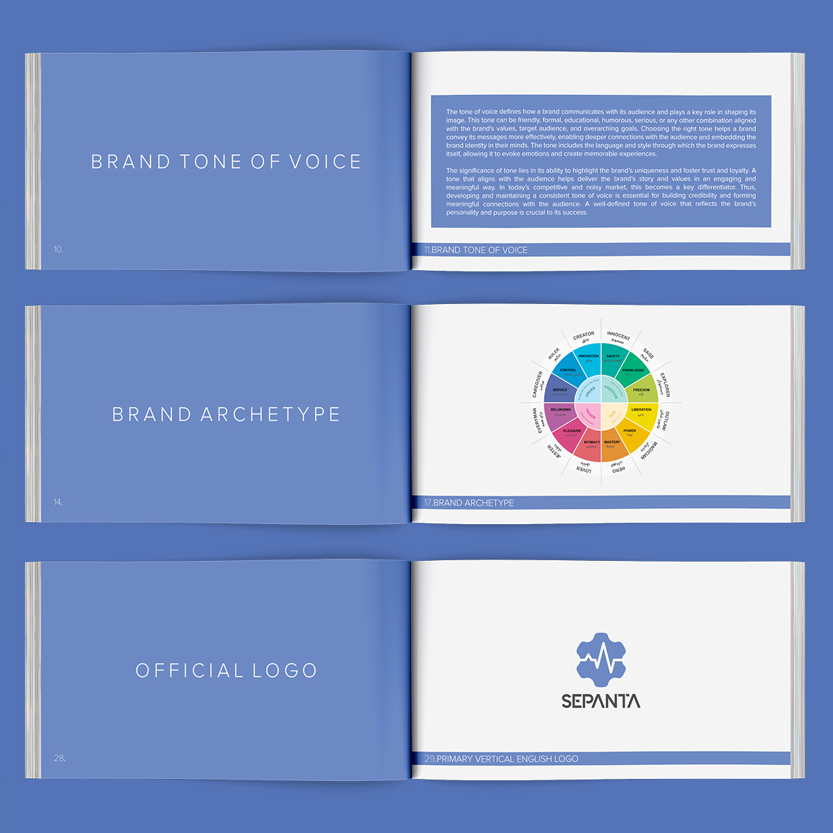
Every core element is thoughtfully defined: from mission and tone of voice to archetypes, logo usage, color palette, typography, and branded assets like uniforms and stationery. The brand tone is expert, trustworthy, and accessible, aligned with the Caregiver, Sage, and Everyman archetypes to express compassion, knowledge, and inclusivity.
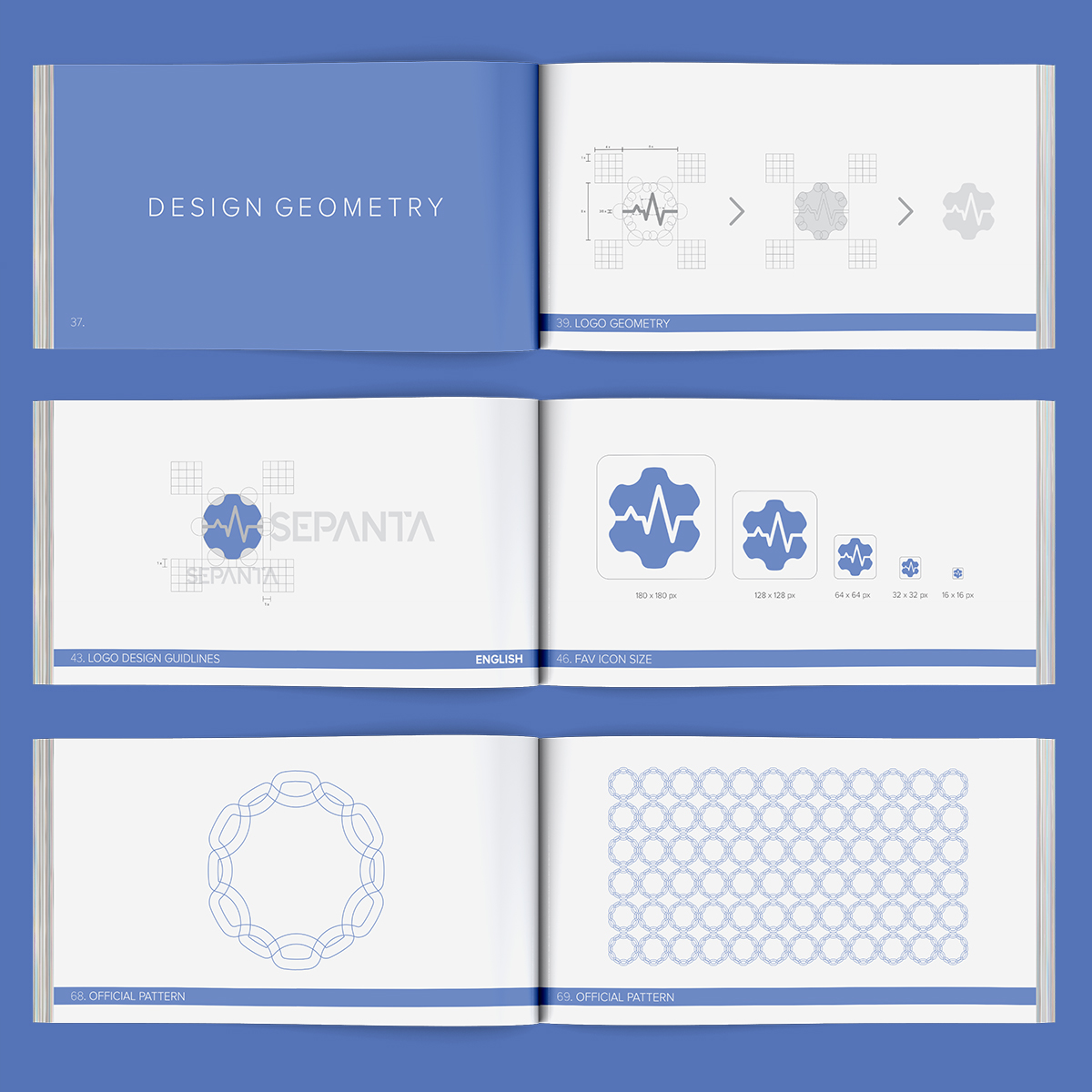
A key part of the process was the complete redesign of the Sepanta logo geometry. We corrected structural inconsistencies in the curves, spacing, and alignments, rebuilding the logo on a precise geometric grid. This enhanced both the visual harmony and functional performance of the mark across all formats.
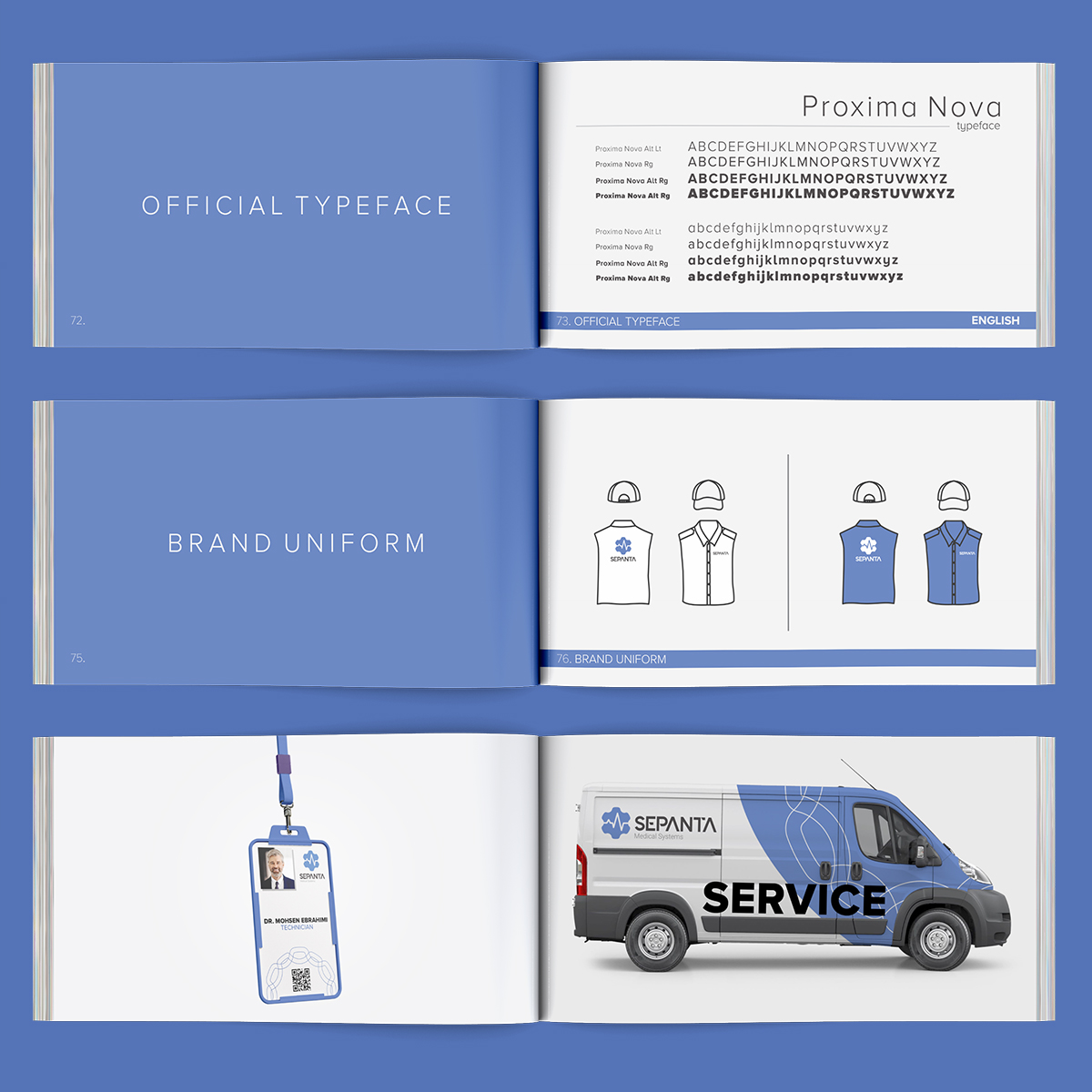
Dominated by calm, reliable blue tones and supported by neutral accents, the identity feels both professional and human-centered. These guidelines now serve as a cohesive foundation for Sepanta’s brand presence across digital and physical environments—ensuring it communicates clarity, trust, and medical excellence at every touchpoint.