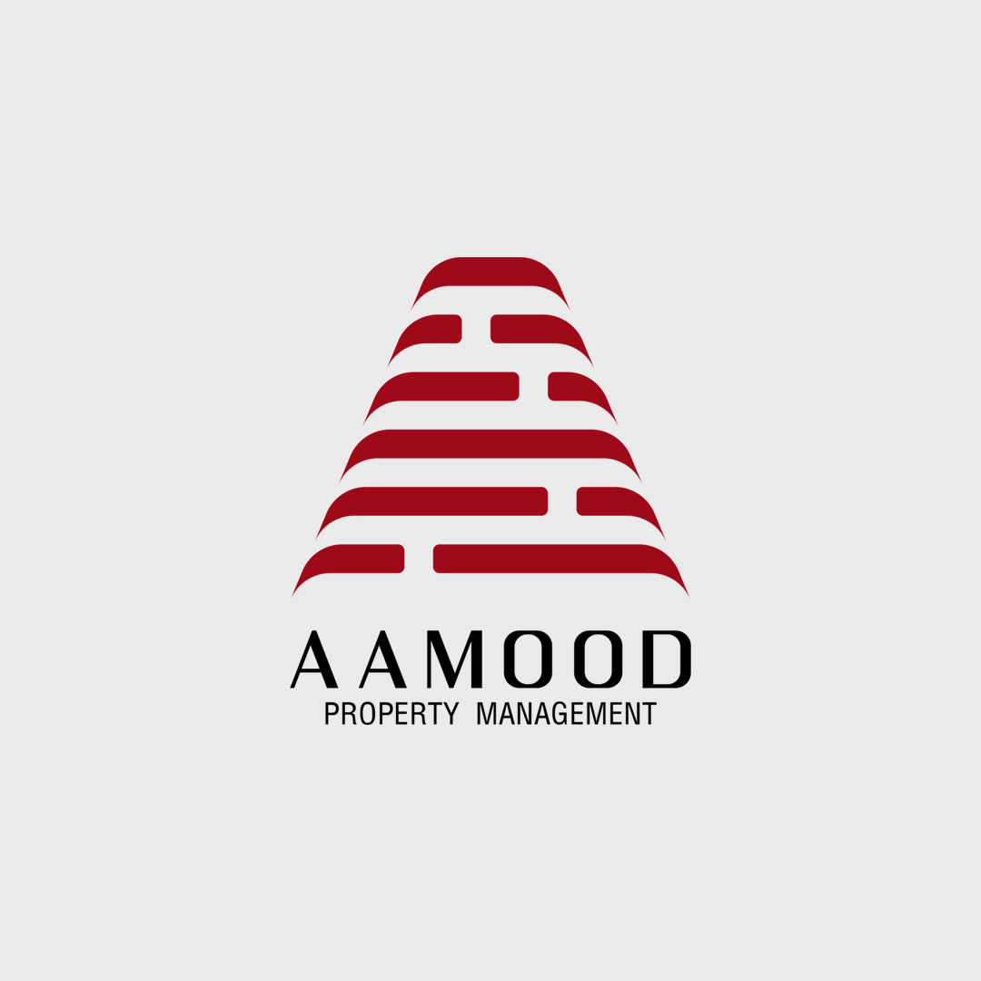
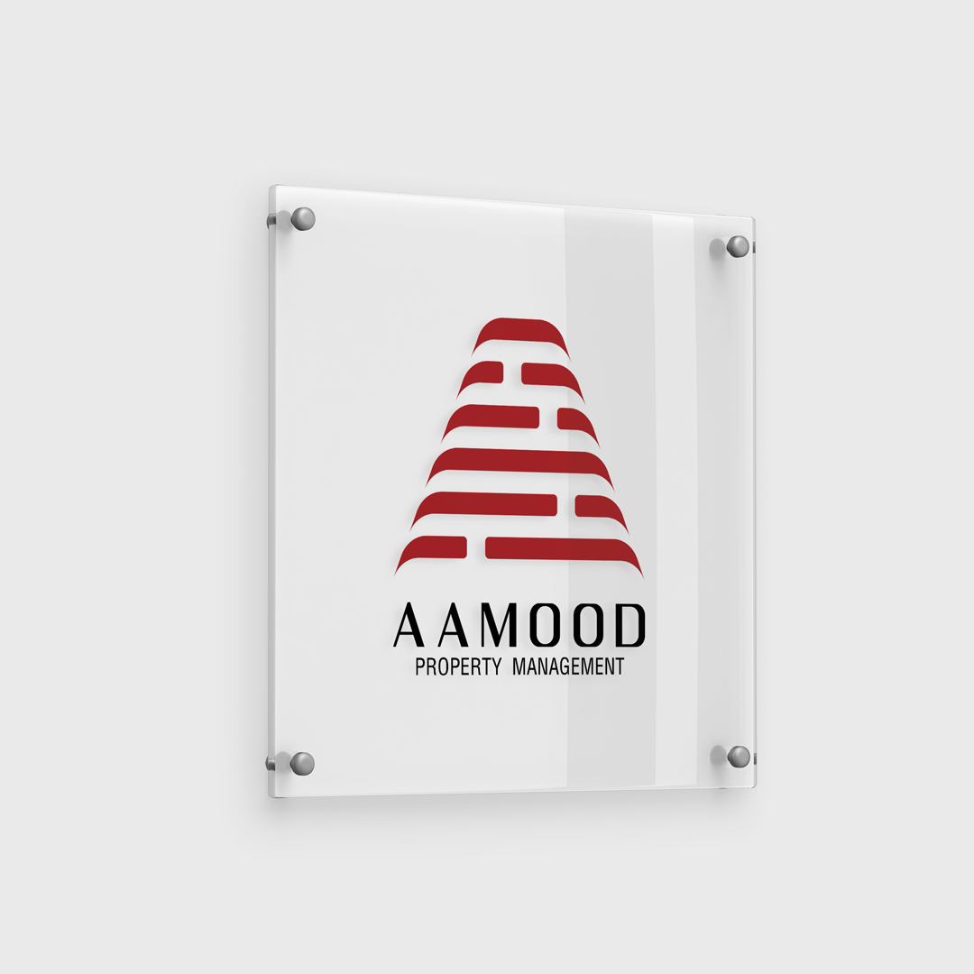
Aamood Logo Design
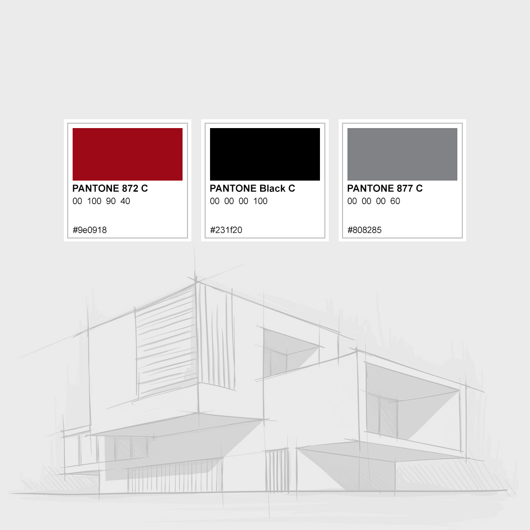
The logo design for AAMOOD Property Management uses a bold and structured visual to communicate strength, stability, and architectural precision. At its core is a stylized letter A, formed by layered brick-like segments that evoke the idea of building, construction, and long-lasting foundations—key themes in the property management industry. This monolithic shape not only represents the brand's initial but also symbolizes upward growth, reliability, and professional structure. The deep burgundy red color adds a sense of trust, confidence, and sophistication, making the brand stand out in a competitive market.
This logo design is both symbolic and scalable, suitable for everything from signage to digital presence.