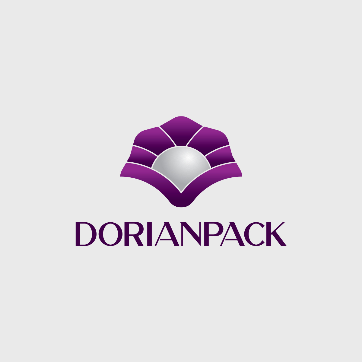

Dorian Pack Logo Design
The logo design for DorianPack, a brand operating in the packaging and disposable container industry, draws inspiration from nature’s elegance and symbolism. At the center of the logo is a stylized seashell embracing a pearl—representing beauty, purity, and authenticity. The shell element not only adds visual sophistication but also conveys protection, reflecting the core function of high-quality packaging: safeguarding the contents within.
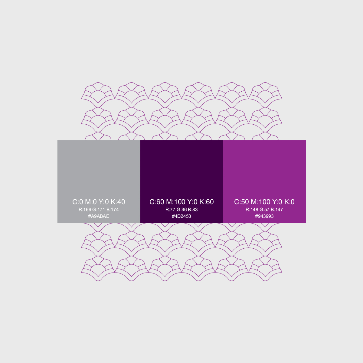
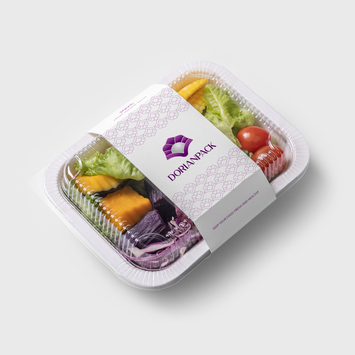
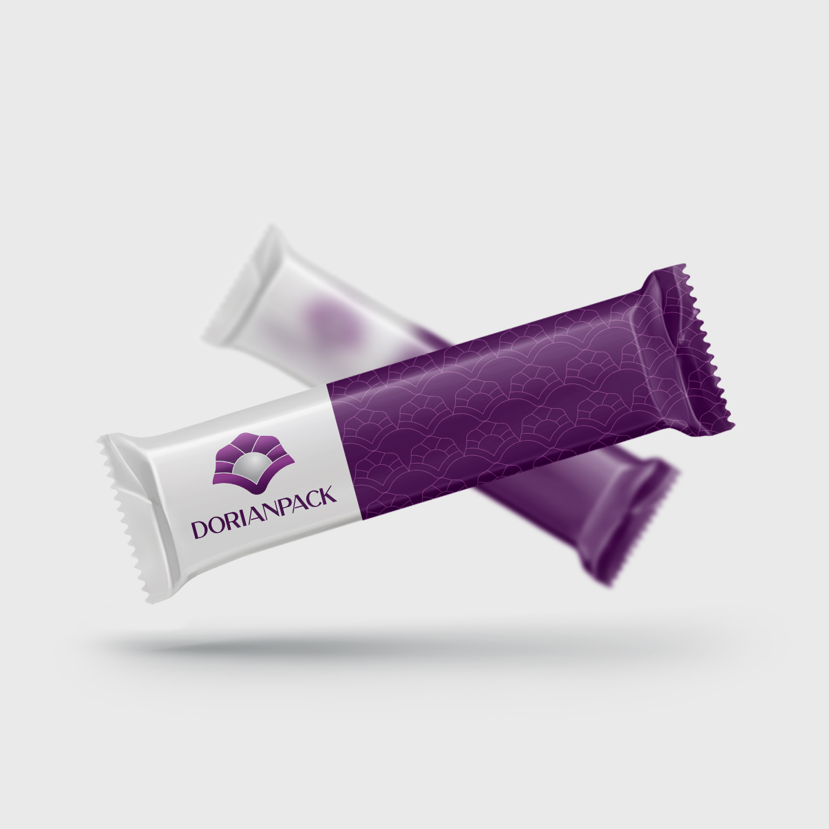
This pictorial logo design uses abstract yet familiar forms to visually connect the brand name to its purpose. The composition remains clear and impactful across various sizes, making it highly adaptable for both digital and print applications. The use of purple tones evokes a sense of luxury and refinement, while the soft silver of the pearl suggests value and precision—reinforcing the brand’s commitment to quality.
By combining symbolic storytelling with elegant execution, this logo invites trust and emotional connection. It stands out in a competitive market and successfully positions DorianPack as a premium choice in the world of packaging solutions.