
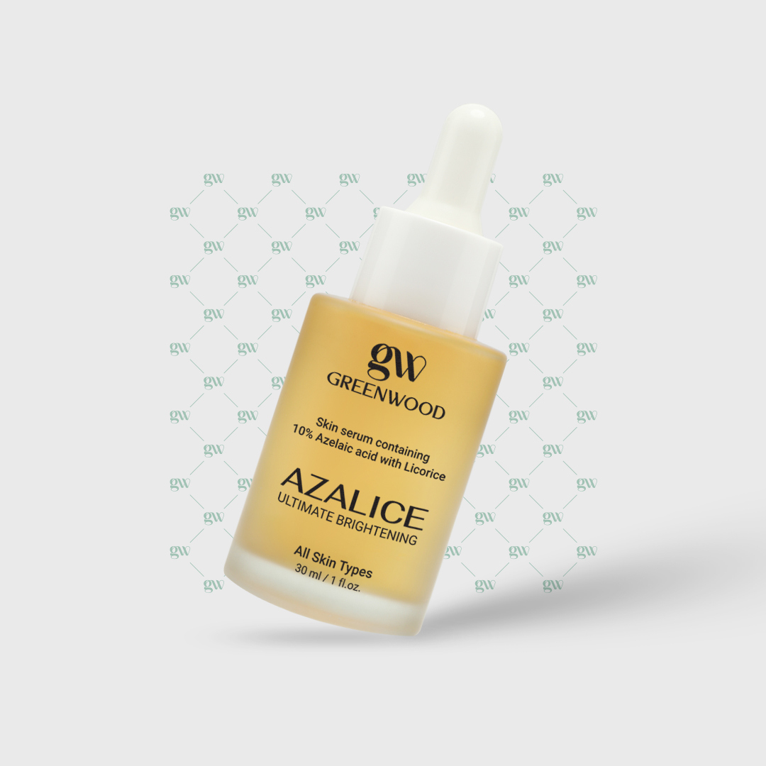


Greenwood Logo Design
The logo for Greenwood, a brand specializing in skincare and cosmetic serums, is designed with simplicity and symbolism in mind, reflecting the brand’s core values and philosophy. The artistic and balanced composition of the letters “G” and “W” communicates a sense of precision and attention to detail—qualities that mirror Greenwood’s commitment to producing high-quality skincare products.
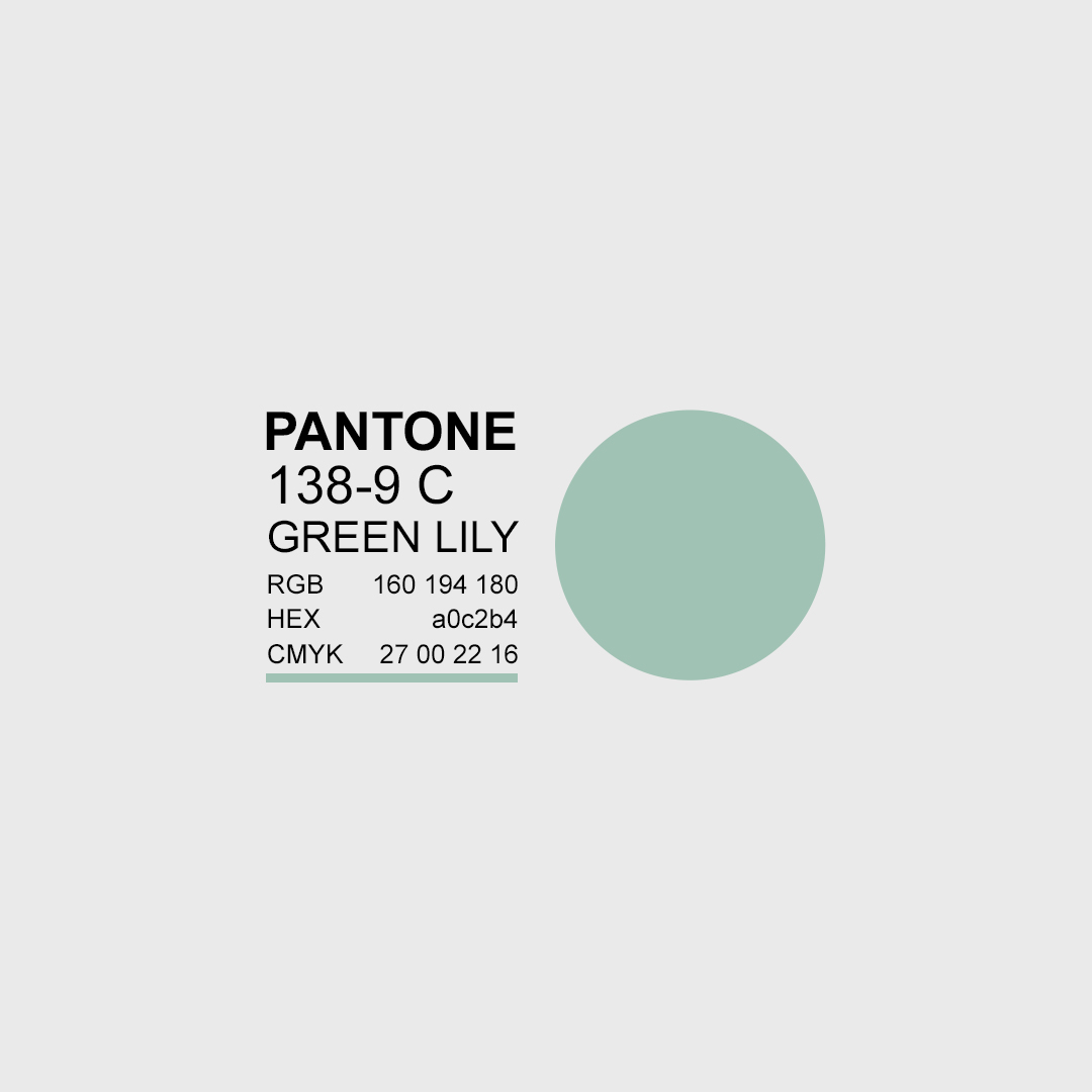
The chosen color, referred to as “Green Lily”, evokes a sense of purity, freshness, and a deep connection to nature. It visually reinforces the brand’s emphasis on natural ingredients, wellness, and serenity. This soft and calming tone not only adds beauty to the logo but also aligns seamlessly with Greenwood’s promise of gentle, effective, and trustworthy skincare.
With its refined form and memorable style, the logo stands out as a symbol of reliability and efficacy, ensuring lasting brand recognition in the minds of consumers.