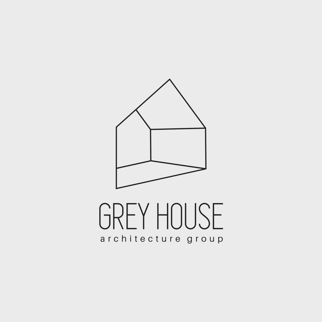
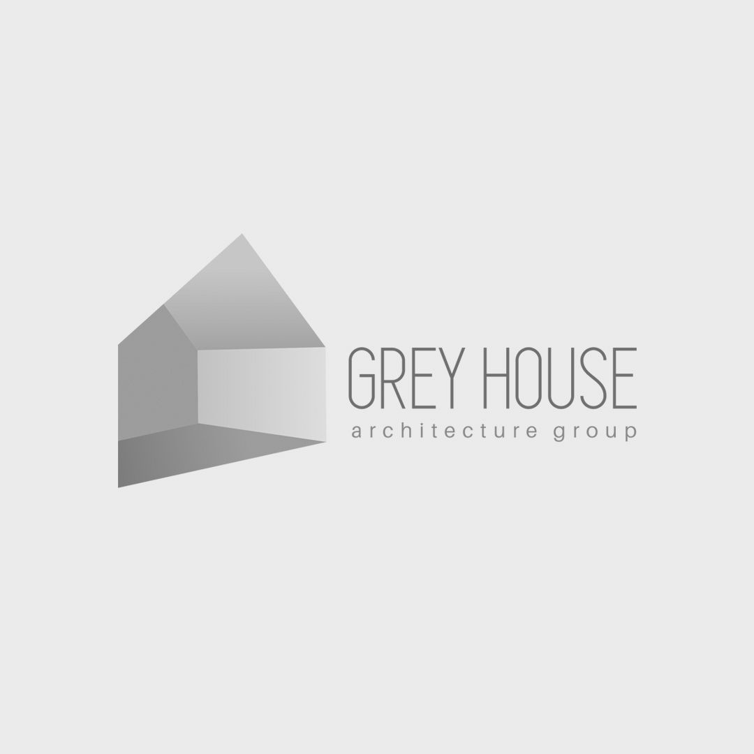
Grey House Logo Design
The logo design for Grey House Architecture Group is a minimal yet intelligent visual representation of architectural space and precision. The icon is crafted in the form of an abstract, geometric house—built using perspective lines that evoke depth and structure, key principles in architectural design. The shaded version uses a soft grey gradient to reinforce the brand’s name while subtly emphasizing the spatial feel. The outlined version keeps the same structure but simplifies the form for versatility across digital and print platforms. This logo design balances clarity with conceptual depth, making it ideal for an architecture brand that values clean aesthetics and modern design principles. The monochromatic palette further strengthens the sense of elegance, neutrality, and professionalism—qualities that align perfectly with the architectural industry.