Mahour Teb Logo Design
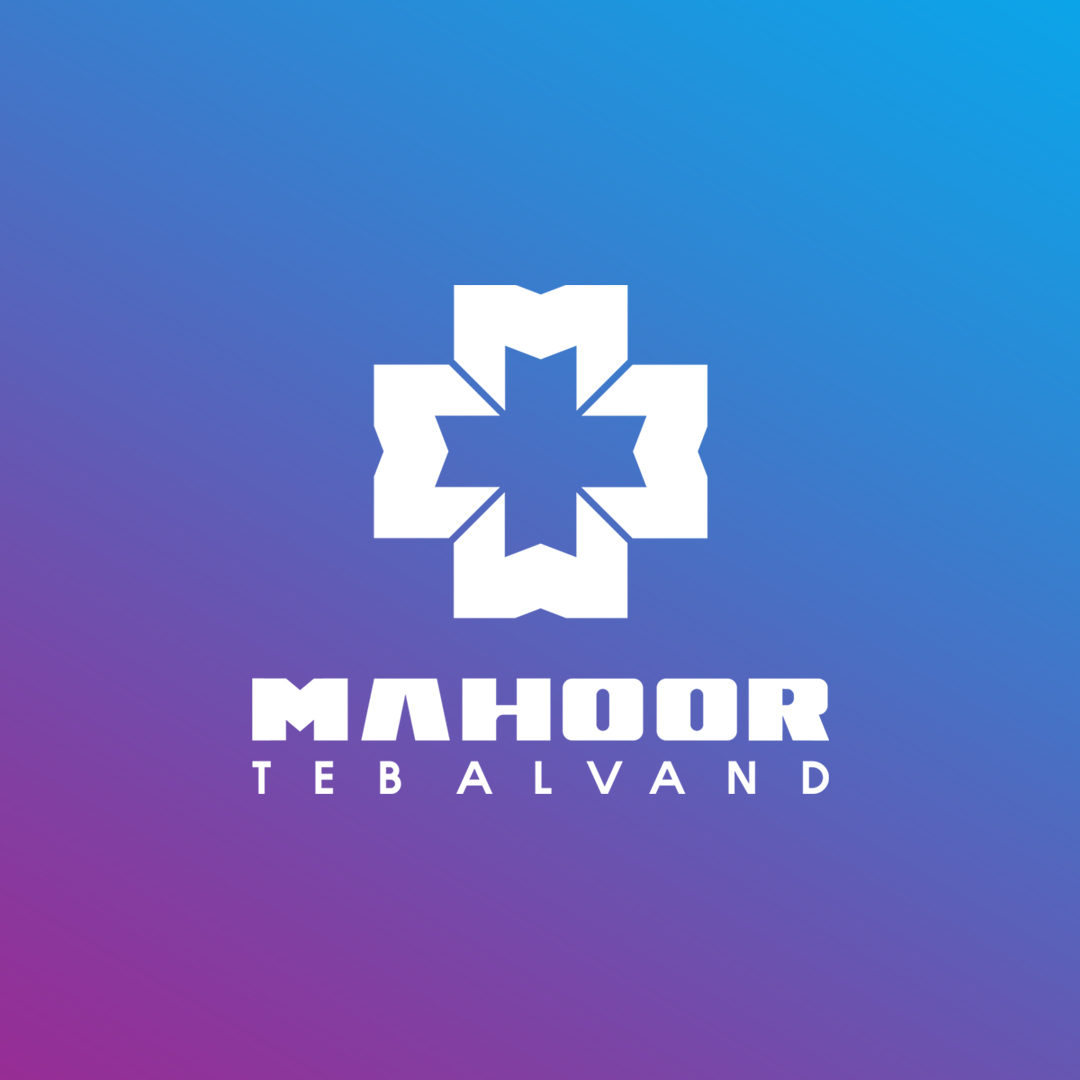
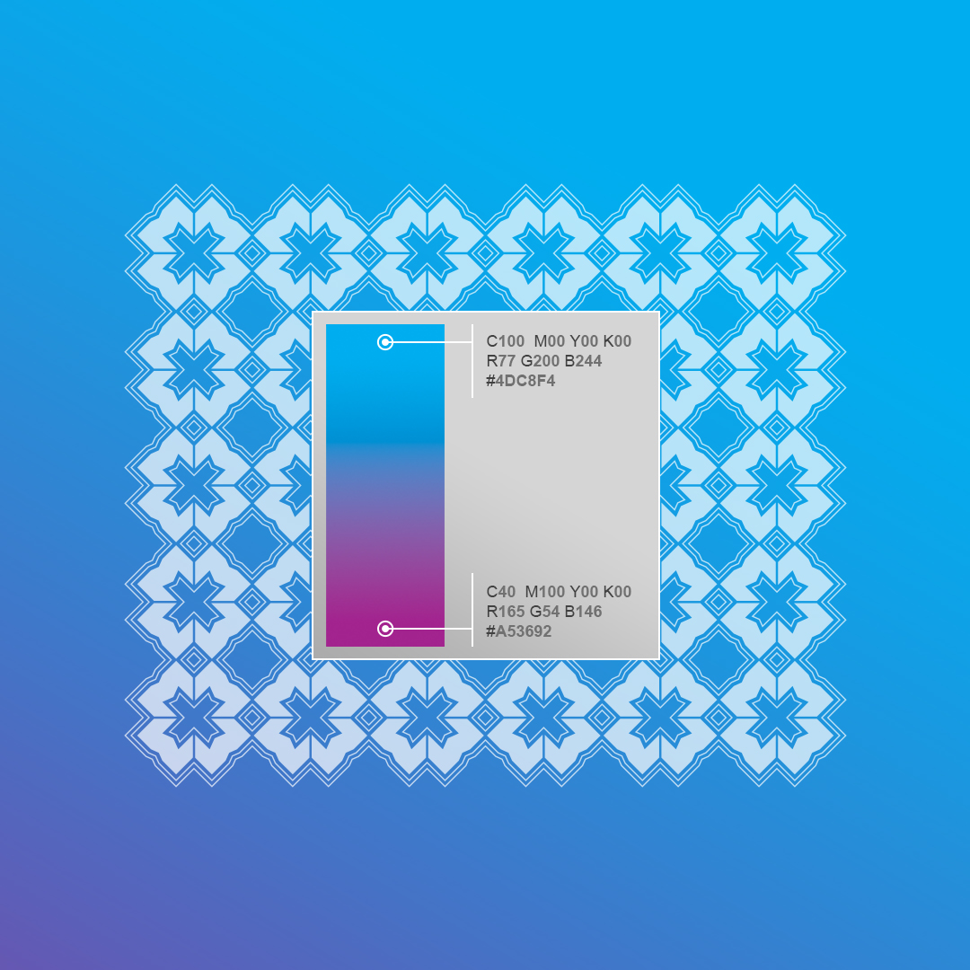
This logo design for Mahoor Teb Alvand is built upon the powerful and timeless technique of monogram design. At the heart of the symbol lies the letter M, the initial of the brand name, masterfully repeated to form a symmetrical geometric structure. The result is not only a stylized monogram but also a multi-layered visual message. The negative and positive spaces together form a cross symbol—internationally recognized (under the Geneva Convention) as the emblem of the medical and healthcare field. At the same time, the composition evokes the shape of a lotus flower from a top-down view. The lotus, often seen as a symbol of rebirth, healing, and eternity, perfectly aligns with the values of a healthcare brand. The gradient blend of blue and purple adds a modern and trustworthy feel, reinforcing the brand’s identity in the medical industry.
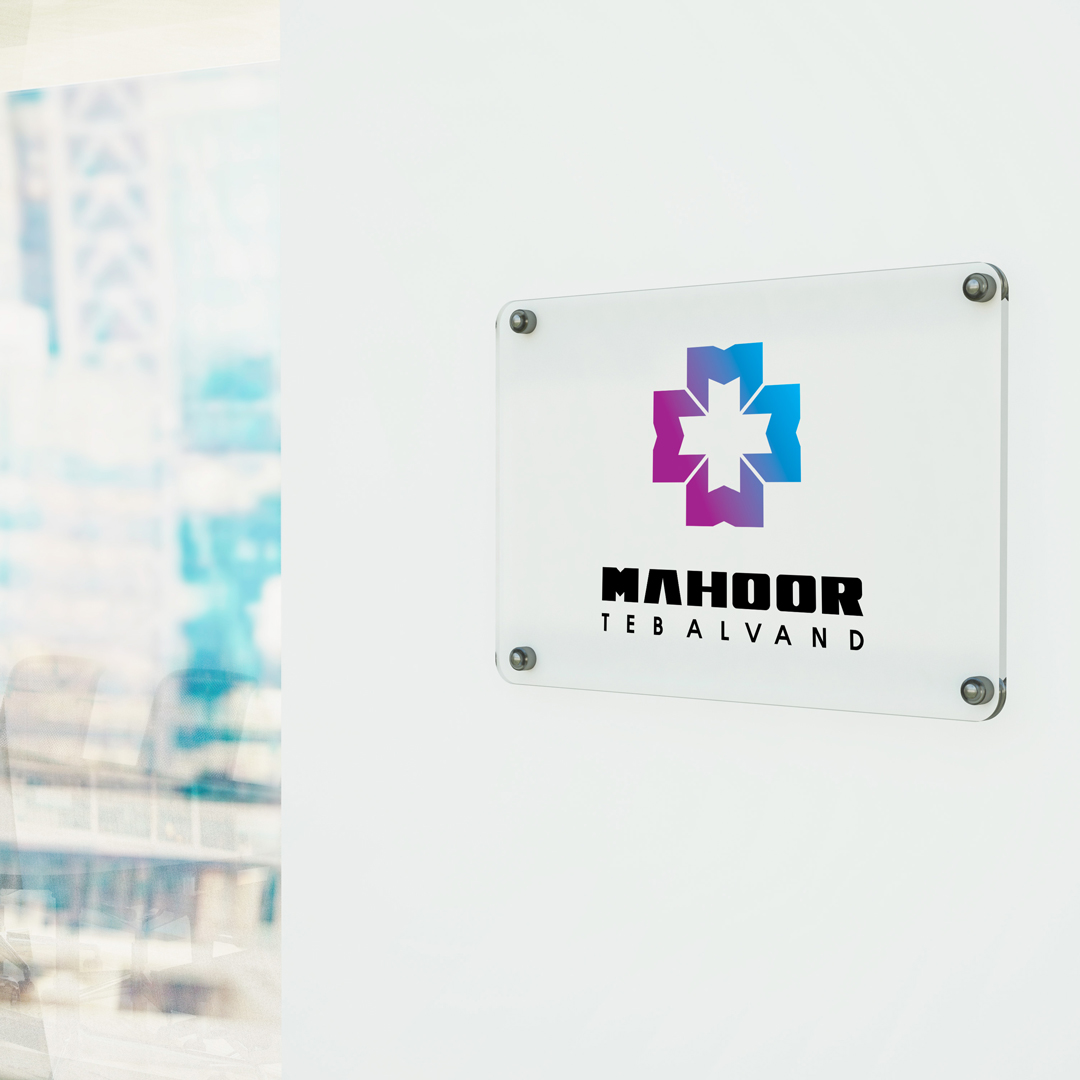
This logo design is both intelligent and memorable, engaging viewers visually and conceptually for lasting brand recall.