

Omid Logo Design
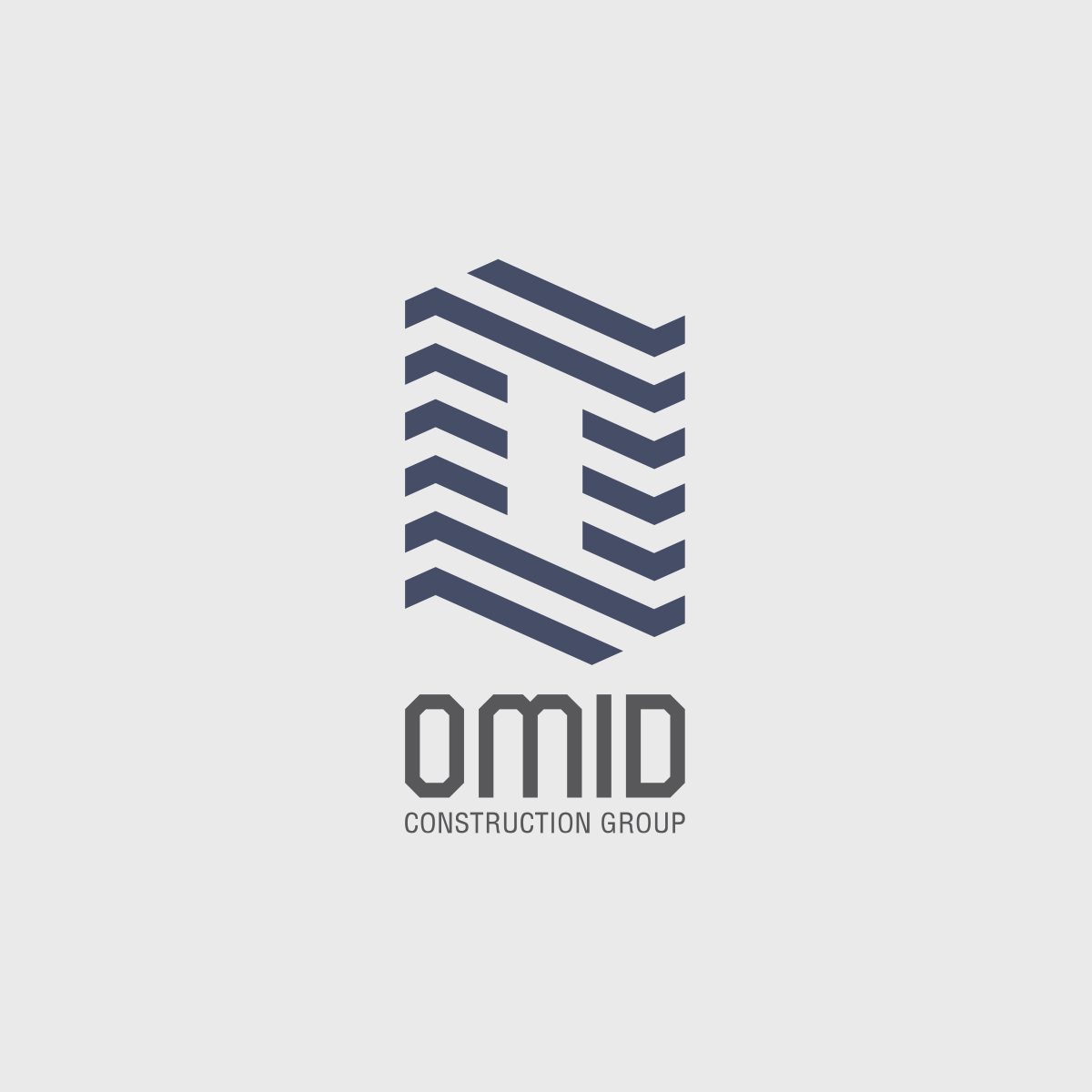
The logo for OMID Construction Group is inspired by architectural elements—specifically the visual language of brick patterns and pitched roofs. The stylized letter “O” forms the foundation of the symbol, constructed through rhythmic, angled lines that resemble layers of brick or structural beams.
The shape not only echoes the initial of the brand name, but also evokes the form of a modern building, reinforcing the company’s expertise in construction and engineering. The use of symmetry and geometry communicates precision, reliability, and professionalism—core values of the OMID brand.
The overall aesthetic is modern and technical, designed to be memorable, versatile, and easily identifiable across both print and digital media. This logo reflects the brand’s forward-thinking mindset while remaining deeply rooted in the solid craftsmanship of construction.