Pan Partners Logo Design
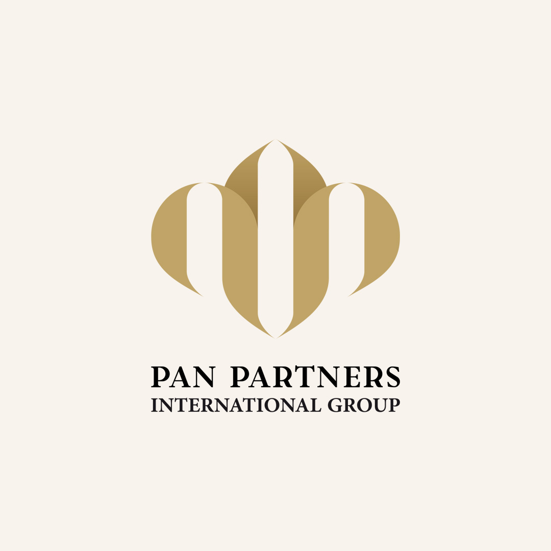
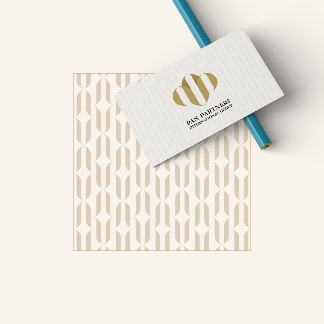
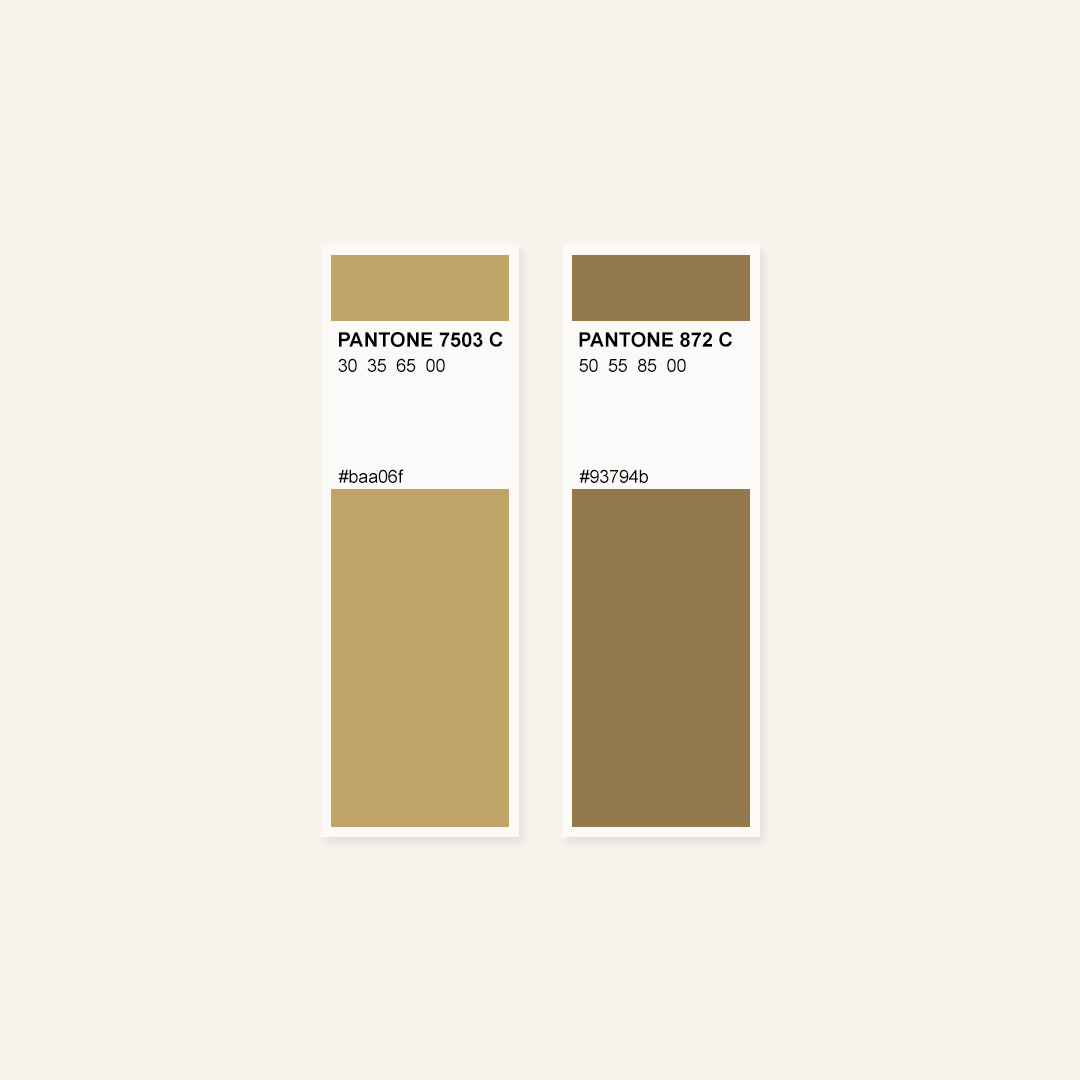
This logo design for Pan Partners International Group uses the refined and timeless monogram technique to create a memorable and prestigious visual identity. The emblem subtly integrates the initials of the brand name into a crown-like form, symbolizing leadership, excellence, and authority. The crown shape evokes a sense of supremacy and distinction, aligning perfectly with the values of a forward-thinking and globally ambitious organization. The golden color palette adds an extra layer of meaning—signifying success, knowledge, wealth, and achievement.
By blending elegant typography with a minimal yet powerful monogram, this logo design communicates luxury, power, and trust—ideal qualities for an international group aiming to lead in its field.
