


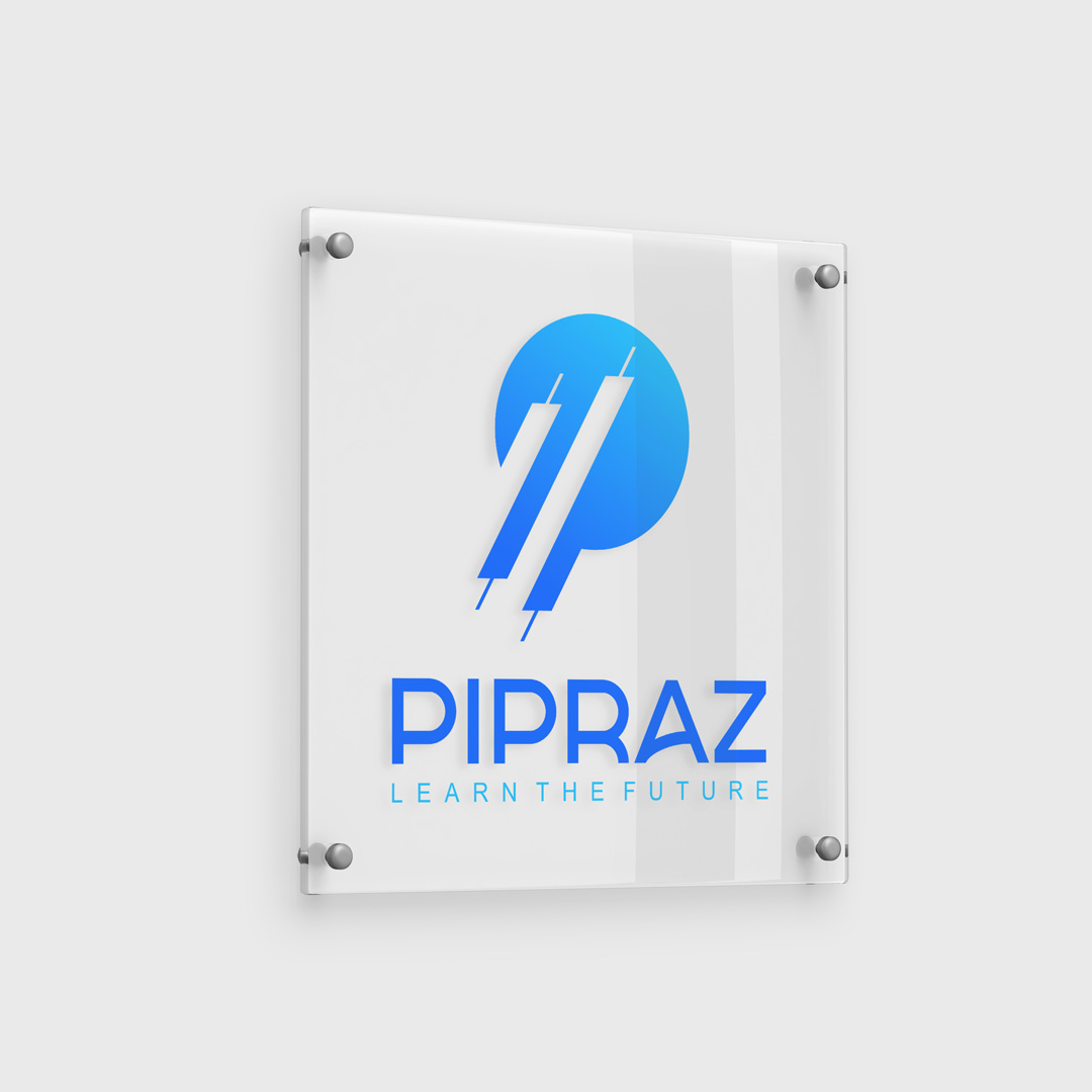

Pipraz Logo Design
The PIPRAZ Academy logo employs a visual mark design technique, utilizing clean, minimal shapes to build immediate recognition and relevance. The concept merges abstract market chart elements—specifically candlestick symbols—with the letter “P,” referencing both the brand name and its core identity in digital trading education.
The logo’s visual structure is designed with clarity and scalability in mind. The two stylized candlestick shapes positioned diagonally within the circular form create a powerful, forward-moving dynamic, symbolizing growth, learning, and momentum. These shapes also form a subtle “P” in the negative space, blending form and meaning into one cohesive icon.
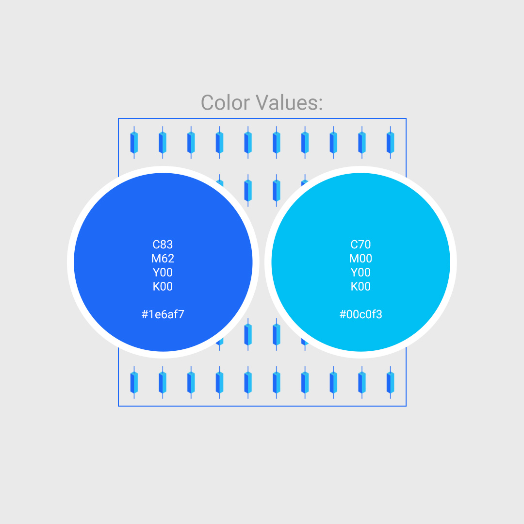
This modern and tech-driven identity reflects PIPRAZ’s vision of preparing individuals for the future of finance. The gradient blue palette communicates trust, innovation, and digital clarity. Most importantly, the simplicity and balance of this visual identity ensure excellent adaptability across platforms—especially digital and mobile—without compromising legibility or brand recognition.
The result is a distinctive, smart logo that positions PIPRAZ as a forward-thinking, expert-led platform in the online trading education industry.