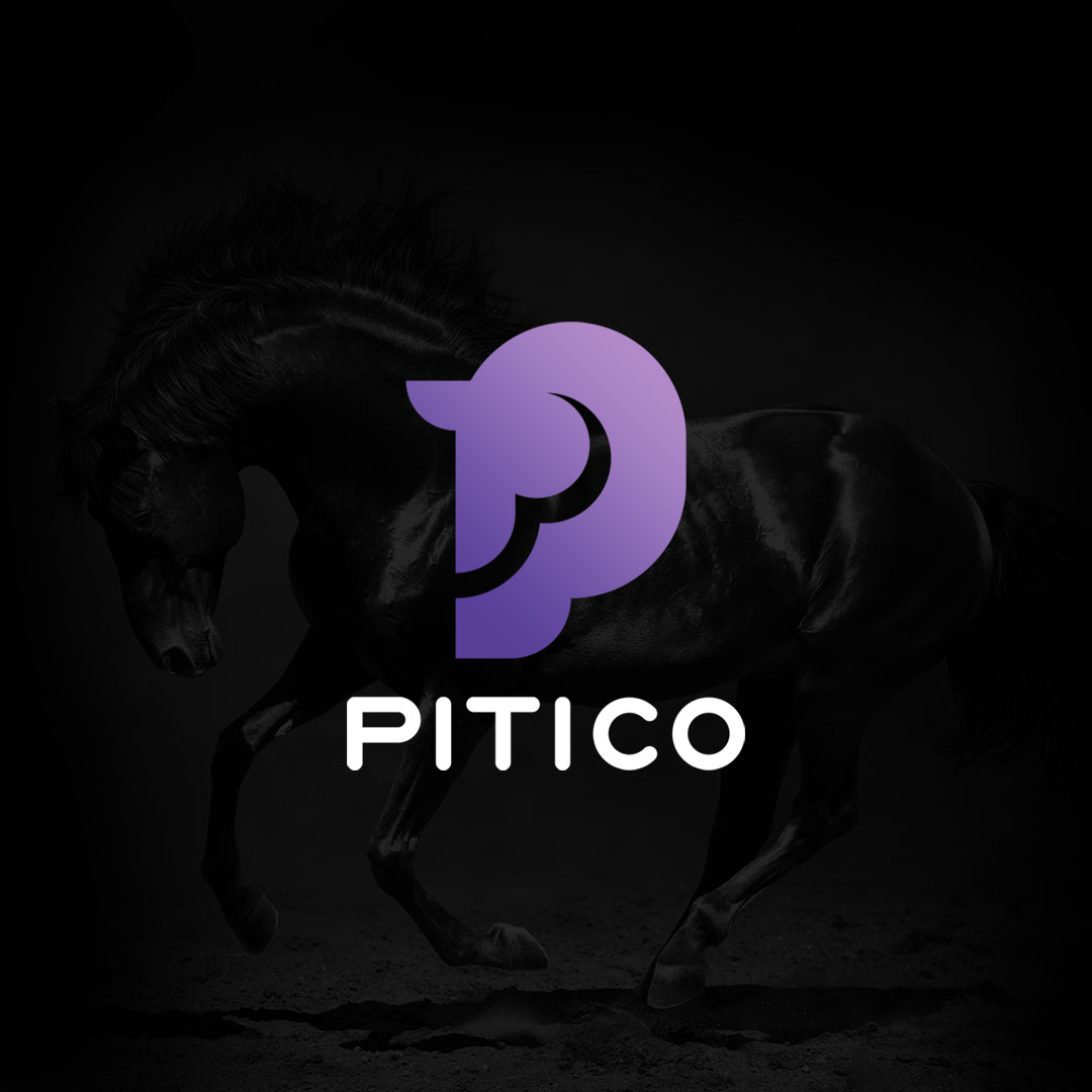


Pitico Logo Design
The PITICO logo was crafted to reflect the brand’s focus on producing and selling playful lifestyle items—such as stationery, notebooks, mugs, and pens—with a touch of fantasy and charm. Creativity, distinction, and professionalism were central values emphasized in the design process.
The logo employs a pictorial design technique, blending visual iconography with the letter P, the first letter of the brand name. The symbol is deliberately minimalist, making it approachable and memorable for a broad audience.
At the heart of the design lies the abstract silhouette of a horse’s head, cleverly shaped to resemble the letter P. This unique fusion captures the brand name visually while adding a sense of imagination and personality. The result is a whimsical yet professional logo suitable for a wide age range.
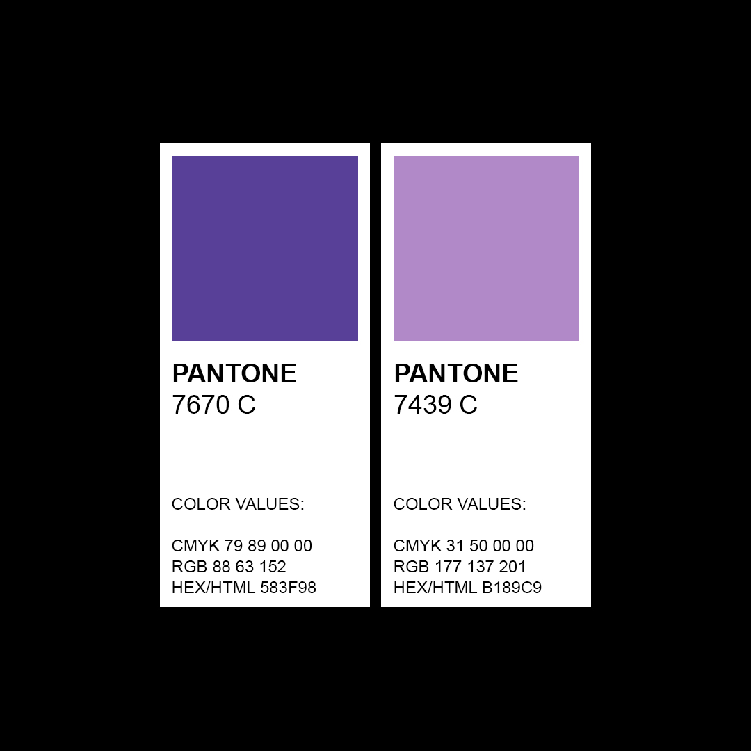
Given that PITICO’s primary audience includes women, a soft lavender hue was chosen. This color represents kindness, calmness, and compassion, aligning perfectly with the emotional qualities the brand seeks to convey.