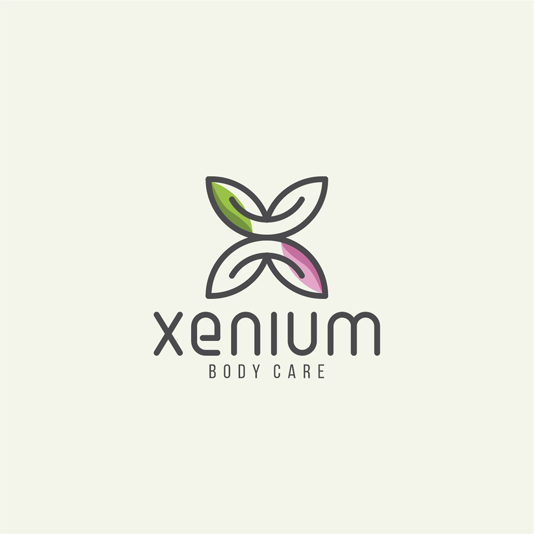
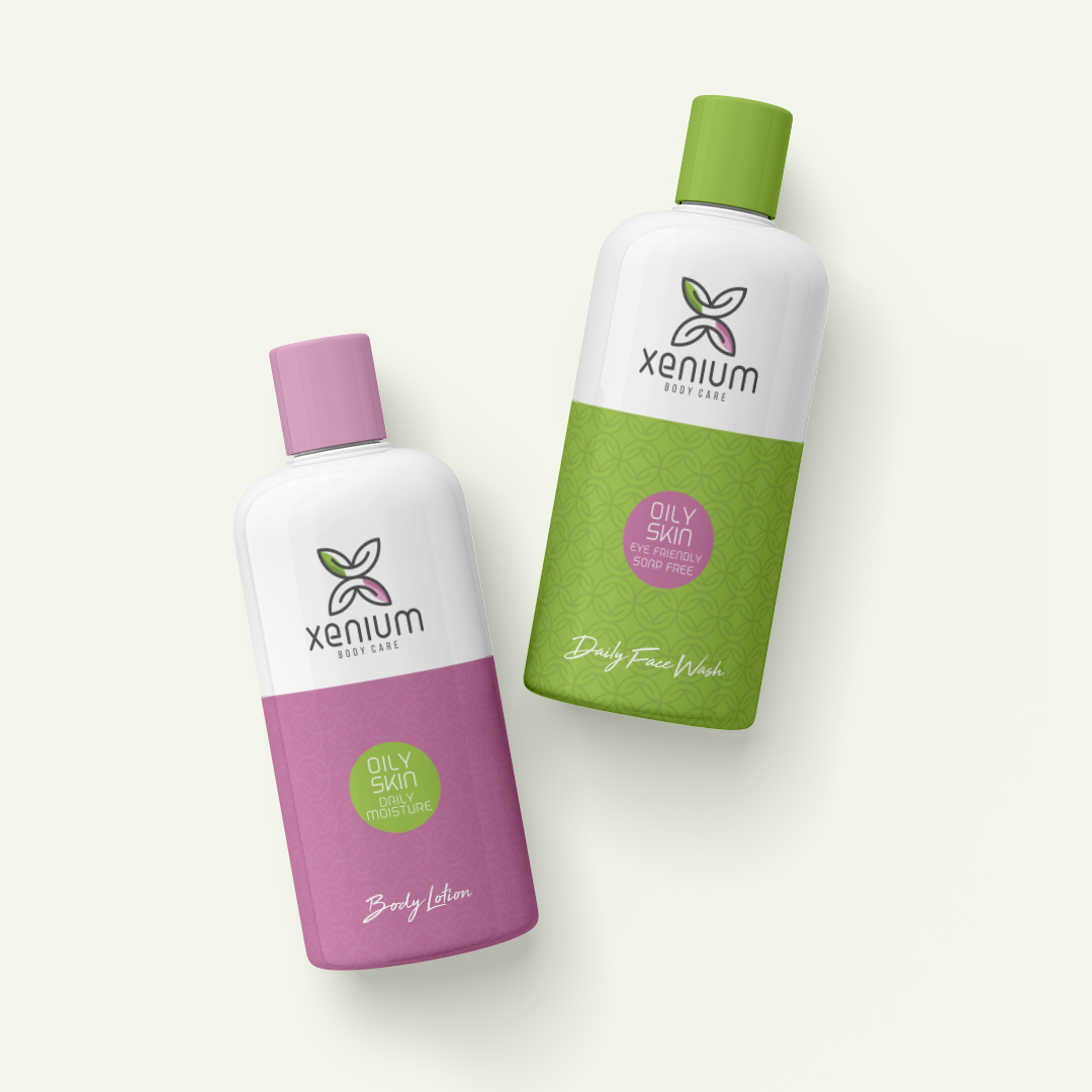
Xenium Logo Design
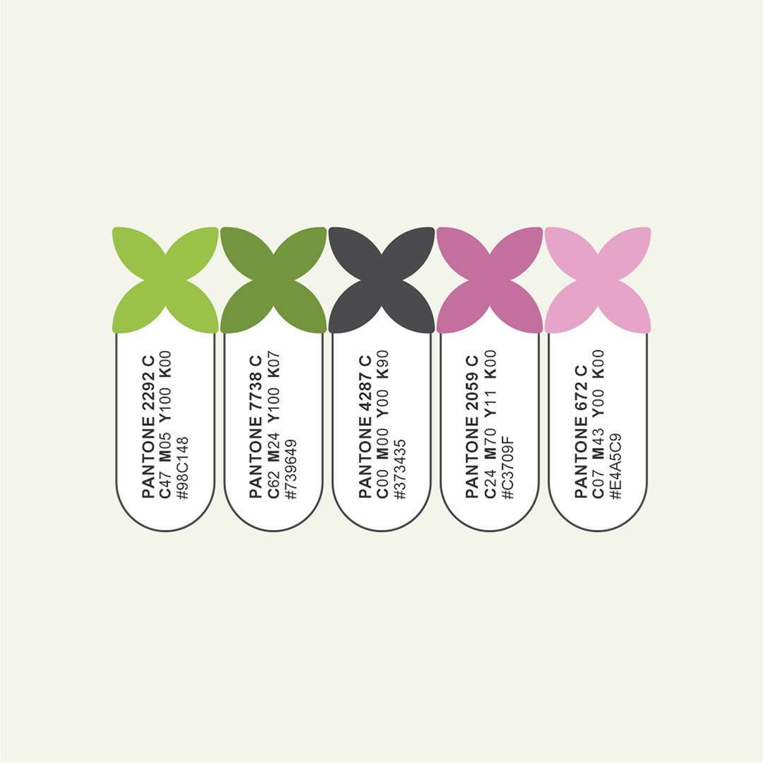
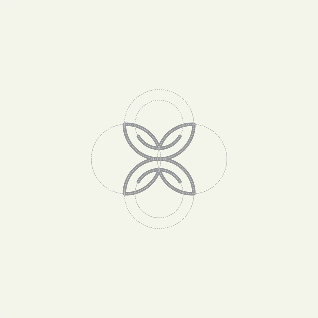
The logo design for Xenium Body Care is a harmonious blend of nature and self-care, represented through an elegant and organic symbol. The icon forms an abstract “X” using four intertwining leaf shapes, symbolizing balance, vitality, and botanical purity—core elements of a body care brand. The use of natural tones—green and soft pink—further enhances the brand's emphasis on plant-based, gentle, and holistic care. The modern lowercase typography with rounded edges adds a soft, approachable feel, perfectly complementing the wellness industry.
This logo design communicates freshness, trust, and modern simplicity, making it ideal for product packaging, online presence, and health-conscious branding.